| Timeline: | 12 weeks. A native APP from scratch. |
| Tools: | Pen and Paper, Axure, Photoshop, Illustrator |

|
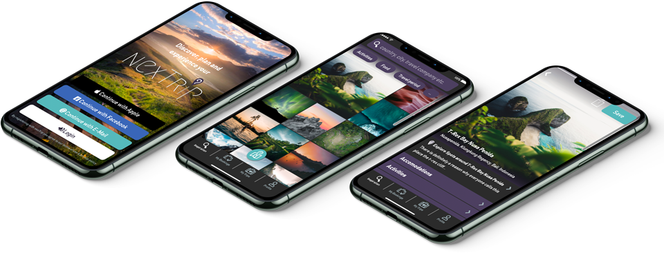
Have you already had a lot of ideas for your next travel experience and find it hard to choose which one to go for? "NexTrip" helps to improve the travel decision-making experience for the users. |
| Timeline: | 12 weeks. A native APP from scratch. |
| Tools: | Pen and Paper, Axure, Photoshop, Illustrator |
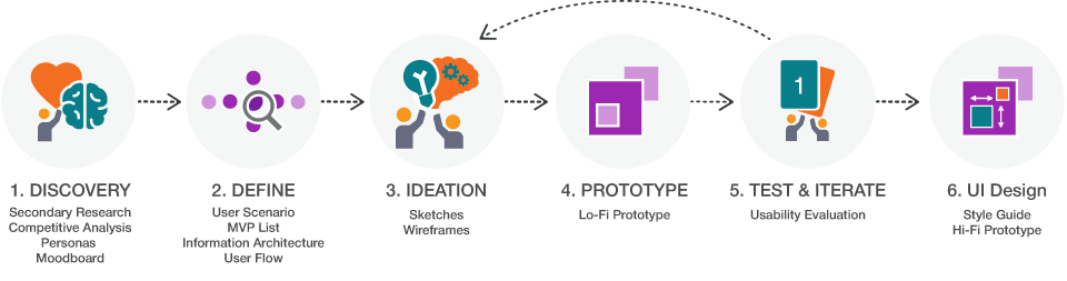
Research, User Flows, Information architecture, Sketching, Wireframing, UI, Prototyping, Testing, and so on.
Overall active as solo designer.
Deciding on your next travel experience can be difficult. People ask themselves how they can find good travel experiences that match their interests and preferences. Sometimes they feel that they do not have enough information to make a decision. Or they do not want to spend too much time researching for travel. They also do not want to take the risk of trying blindly.
Provide visual travel recommendations based on the users interests and preferences.
Show relevant reviews for users to help them make a decision easier.
Provide travel experience inspirations by promoting suggestions from family members, friends, and experts they trust.
To ensure that I do not waste my time trying to solve a problem that does not even exist, I have done secondary research to collect data and evidence. My hypothesis is based only on my own experience and is only an assumption at this stage. Is the problem I am trying to solve really a problem for others?
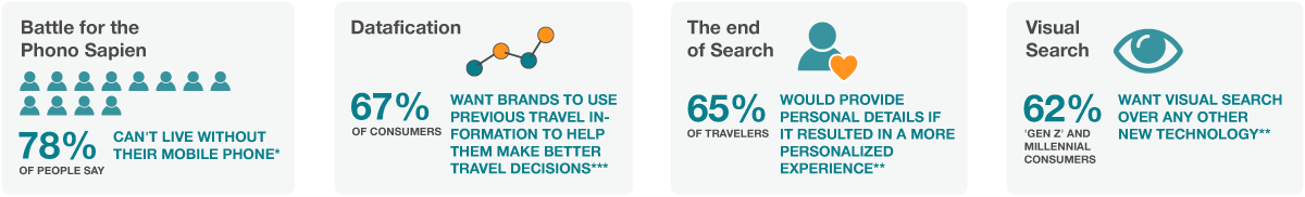
I found out that there is a trend that travelers expect personalized visual impressions to get inspired for their next travel experience:
 |
||
| Sources * Business wire, ‘New Research from ViSenze Finds 62 Percent of Generation Z and Millennial Consumers Want Visual Search Capabilities, More Than Any Other New Technology’, Aug 2018 ** How travelers are using mobile in 2019 - End traveler and industry research, Travelport Digital *** YOUNIQUE – PERSONALIZED MARKETING INDEX – The New Travel Experience, Accenture Interactive |
To learn from existing services, I identified five competitors:
TripAdvisor, Trip.com, Timeout.com, Lonely Planet Trips and Mapify.
In the research, I focused on how customizable the suggestions/search results are.
As an outcome of the competitive analysis, I got familiar with the current travel apps and websites and find out they are suitable for general search but some lack of personalized suggestions.
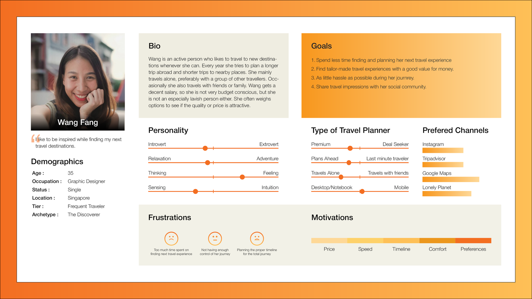
Based on the information gathered by the secondary research and from other travel app case studies, I created some initial personas and use cases for the app.
Sources:
The personas would help me during the design phase to decide about which design solutions I should follow.
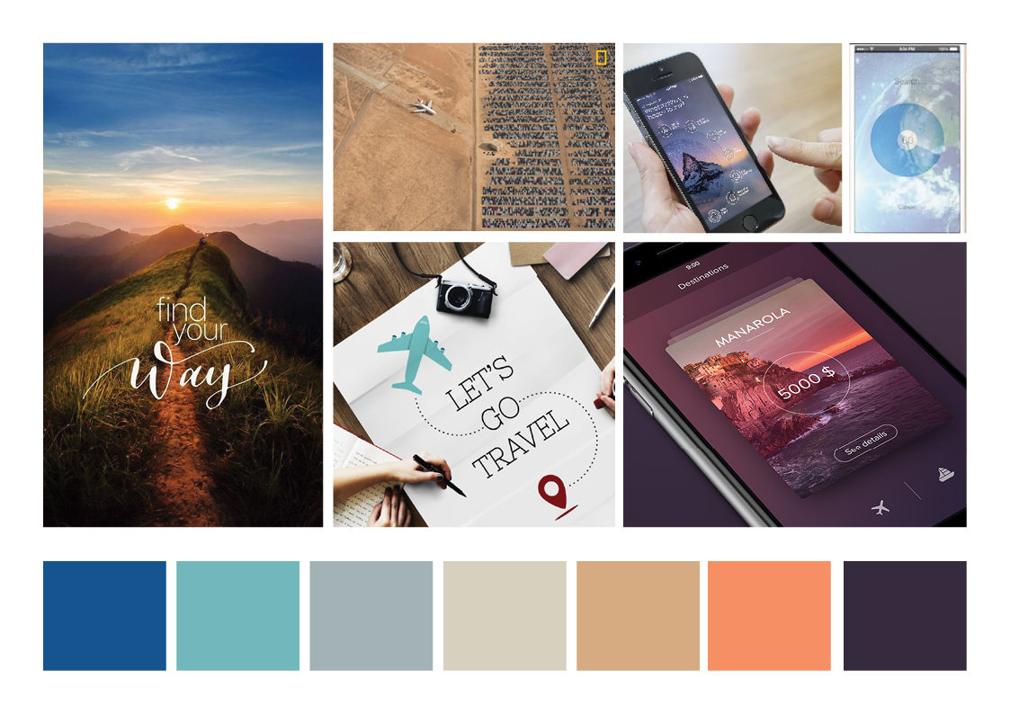
With the user personas in mind, I looked for design inspirations by searching the web. I collected imagery, videos, and interaction styles that speaks to the tone, brand voice, color palette, and typography style that the brand identity of the app will ultimately consist of. Then, I arranged it into a cohesive MOODBOARD to inform my brainstorming process.
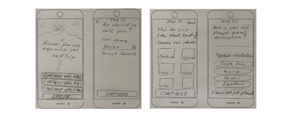
With the help of the moodboard and user personas, I began to sketch ideas for the mobile app experience.
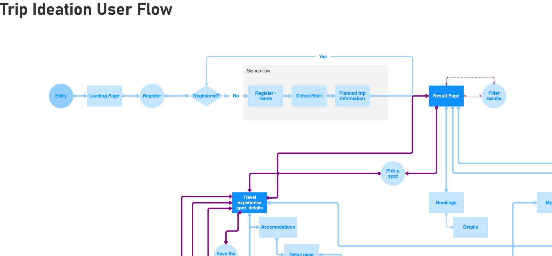
At this point, I started creating USER FLOWS to map out all of the different screens that I’ll need to design for the app and show how each of them flows into the other. When creating the user flows, it was sometimes difficult to figure out the user flow with its screens from the description of the persona alone. So I decided to write down USER SCENARIOS first. This would help me to discover all screens and features needed for the app.
Finally after the additional description of the user scenarios following three main user flows showed up:
Here an example:
After I got some few strong ideas on paper, it was time to start creating low-fidelity mockups of the app.
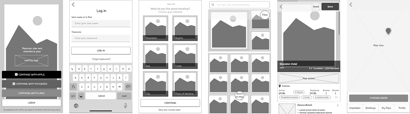
To understand how users actually flow through the application, I created a first low-fidelity prototype for the three main flows to test with real users.
After several iterations of gathering feedback from real users and a UX expert while refining the user flow and wireframes, the following low-fi prototype came out.
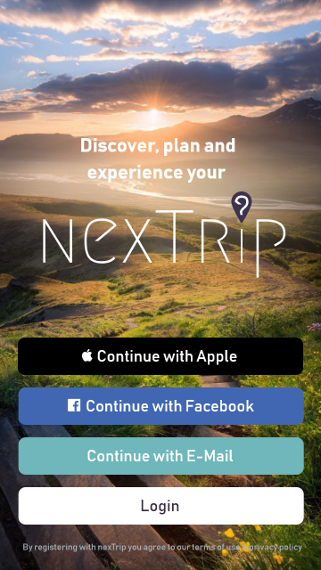
Based on the moodboard I created a STYLE GUIDE that helped me to build a high-fidelity version of the prototype.
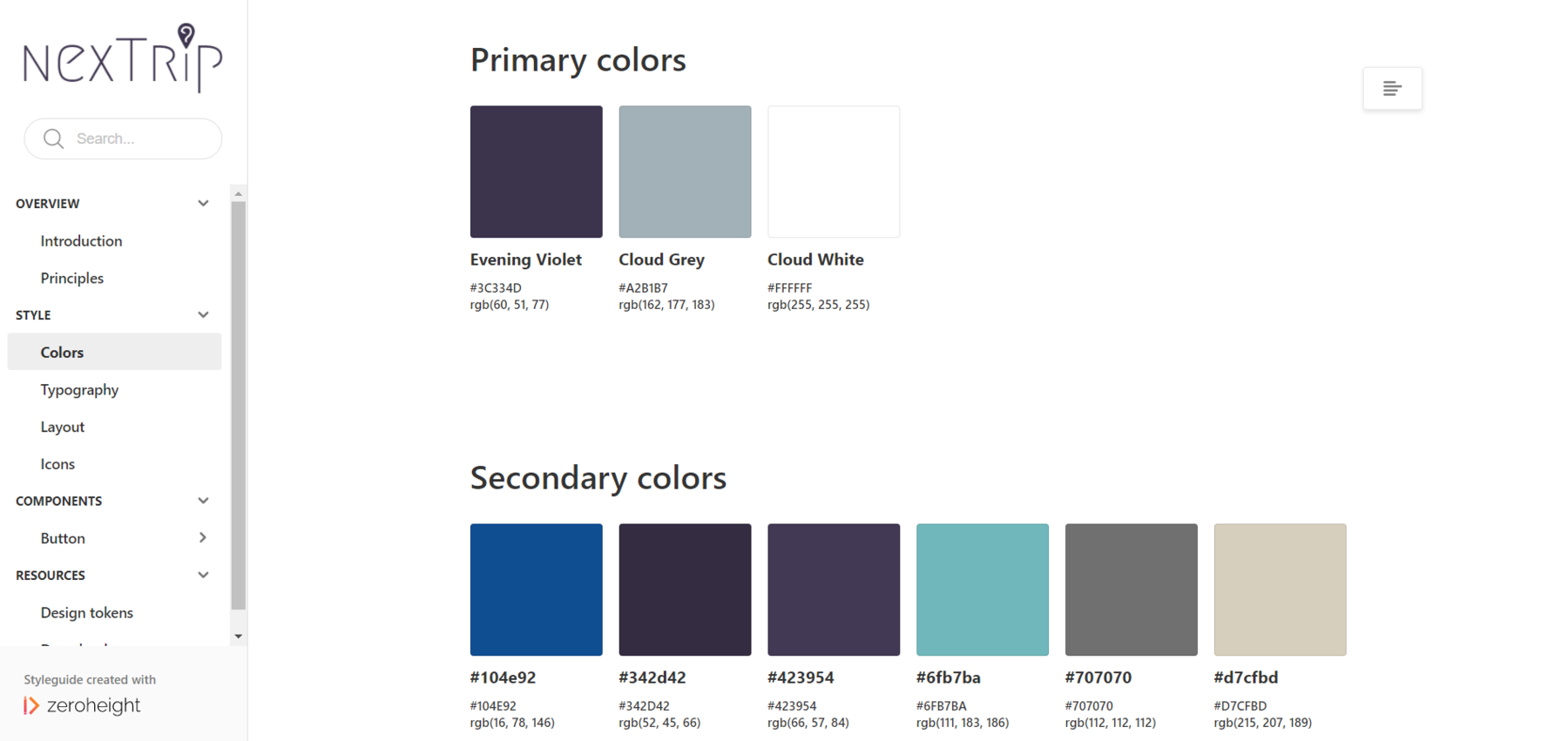
With the style guide in hand, I now began to create a more detailed high-fidelity design of the app, focusing on adding color, icons, fonts, buttons, and any other elements I thought would be included in the final version of the app.
Since I do not have a large social network to conduct user research in the form of ethnographic and contextual inquiries, I decided to research other similar case studies of travel apps on the Internet. I found that these were also a very good source to confirm my assumptions and create personas for the app.
Starting to create user flows without having the ideal user scenarios written on the table can be sometimes not so easy. For me it was easier to refer to something written rather to recall it from the brain. I think it helped me not to forget anything important that should be included in the design of the app.
Share the site
Share the page